Categories
Science & Technology Video Clips

Conception to Birth, Visualized

Alexander Tsiaras is a whiz at scientific visualization. In his early days, he created lenses for microscopes, most notably for the one that captures the very first images of human eggs in an in vitro fertilisation (IVF) program.

In his presentation from a TED conference in 2010, the scientist talks about how the instruction sets used in creating a human being are so complex that they are beyond our comprehension. It’s mathemagical. He also shows a visualization of the development of the human fetus. See Conception to Birth, Visualized below. Be warned, there are some graphic images of the “expulsion” process.

[via Geeks are Sexy]

Categories
Arty Awesomeness Featured Video Clips

The State of Wikipedia

You may remember that almost a year ago, JESS3 made a fantastic visualization about the Internet (see it here). Just the other day they released yet another animated infographic, this time on the beloved collaborative encyclopedia Wikipedia, which so happens to be celebrating its 10th anniversary this year. It’s a fascinating look at the inception of this online encyclopedia, the phenomenal amount of interest in it, and contributions made to it. Check it out below.

See and read more about the project at www.thestateofwikipedia.com.

[via Brain Picker on Twitter]

Categories
Awesomeness Science & Technology Video Clips

Here Be Asteroids

Douglas Adams once said, “Space is big. You just won’t believe how vastly, hugely, mind-bogglingly big it is. I mean, you may think it’s a long way down the road to the drug store, but that’s just peanuts to space.” We’re discovering new spacey things all the time as seen in this fantastic visualization that captures in time-lapse the asteroid discoveries over the past 30 years. It starts off with slow with less than 10000 discoveries in the early 80s but more waves become visible with technological advances in the decades that follow.

As asteroids are discovered, they are highlighted white and change colour depending on whether their orbit crosses that of Earth (called “earth crossers” and shown in red) or approaches Earth (shown in yellow). All other asteroids are highlighted in green.

See Asteroid Discovery From 1980 – 2010 below.

[via Buzzfeed]

Categories
Cautionary Tales Video Clips

Airspace Rebooted

You may (should) remember the volcanic eruptions at Eyjafjallajökull (pronunciation) in Iceland. The volcano spewed lava and sent out a plume of ash several kilometres up in the atmosphere. The lightning produced in the volcanic plume created a spectacular electrical phenomenon known as a dirty thunderstorm. For fear the that the ash may damage aircraft engines, the airspace of many European countries were closed off, leaving travellers stranded. One could not simply fly into Europe.

Air travel was disrupted from April 15th to April 20th and this data visualization shows the northern European airspace during that time.

For some fantastic images of Eyjafjallajökull, check out The Big Picture’s coverage here and there.

[via Gizmodo | KiTTGT]

Categories
Arty

Nonsensical Infographics

Just the other day, I compiled a small list of infographics that I thought were pretty interesting. They seem to all the rage at the moment and in his “Nonsensical infographics” series, artist Chad Hagen has created a series of complicated graphs that chart nothing in particular but still look absolutely beautiful. Have a look at them after the jump.

Categories
Cautionary Tales Science & Technology

Personas: How Does The Internet See You?

The Metropath(ologies) exhibit at the MIT Museum is an art installation about living in a world that happens to be over-supplied with information. Personas is a component of that exhibit, using some high tech jiggery pokery and the Internet to track your Web persona.

The process couldn’t be simpler – go to the Personas site, type in your name (first and last name, please) and after some number-crunching, it will spit out a data portrait, letting you see you the way the Internet sees you.

Personas scours the web for information and attempts to characterize the person – to fit them to a predetermined set of categories that an algorithmic process created from a massive corpus of data. The computational process is visualized with each stage of the analysis, finally resulting in the presentation of a seemingly authoritative personal profile.

Personas demonstrates the computer’s uncanny insights and its inadvertent errors, such as the mischaracterizations caused by the inability to separate data from multiple owners of the same name.

Here’s the data portrait for onelargeprawn. Click to embiggen.
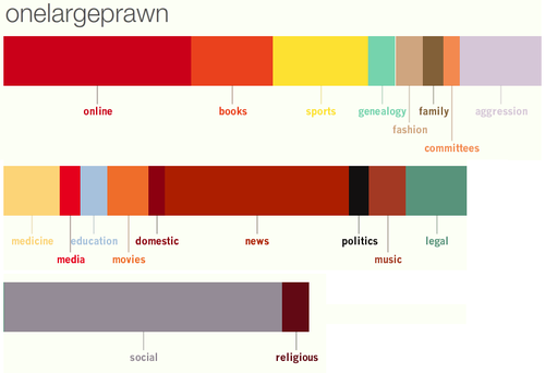
I’m glad there’s no reference to occasional drug abuse (I didn’t inhale), but I’m slightly concerned about where all that aggression is coming from…I bet it’s my doppleganger, I call him Klaus. Say hello Klaus. Hello.

Get your own data portraits at Personas. And let us know how if you find anything interesting.

Data portraits of Jacob Zuma, DJ Fresh, and Megan Fox are after the jump.

Categories
Science & Technology Useful/Useless Info

How Much is a Petabyte?

The other day I was sitting on the toilet and as one does, I asked myself “Dude, like how much is a Petabyte?” Unsurprisingly I hadn’t the remotest clue what the answer was so I quickly changed the conversation to big hairy balls. This is my modus operandi when cornered by difficult questions or people.

It wasn’t until today that I remembered the toilet question and a convenient tweet from shawnroos revealed the answer:

There you have it. Now both you and I can impress the laydeez with our knowledge of frankly useless facts.  :yes: