Categories
Arty Awesomeness Featured Inspirational Designs Photoworthy

You Won’t Believe It’s Varnish in a Fish Bowl

Earlier today I had spotted a post on The Given Collective about the seriously sexy art of Italian illustrator Alberto Seveso. He has become quite famous for mixing black and white portrait photos with colourful vector designs. The style is known as “sperm shaping” and can be seen in his A me mi piace la gnocca! series (possibly NSFW).

I like exposed nipples as much as the next guy but do you know what interests me more than that? Seeing varnish coming into contact with water. In his Medicina Rossa series of photos, he poured a red coloured varnish into a fish bowl full of water, and used a blue varnish in his Sequence verdastra/bluastra/bastarda series. The images of this beautiful reaction look like they could have been computer-generated but Seveso assures people they are not. See them after the jump.

Categories
Arty Awesomeness Featured Inspirational Designs

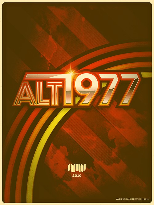
ALT/1977: Modern Tech Re-Imagined as 70s Gear

Given what we know now, I wonder how many of us would love to go back in time and change a couple of things to the betterment of our lives and that of our families? If there’s one thing you wouldn’t want to do, it’s to kill your grandfather, for you then wouldn’t have been born, and consequently would not have been able to go back in time to kill your grandfather. I believe this sticky point is called the grandfather paradox.

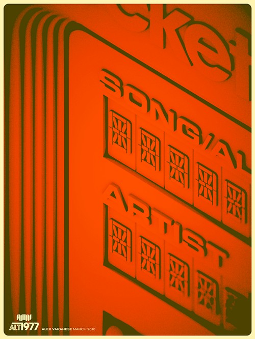
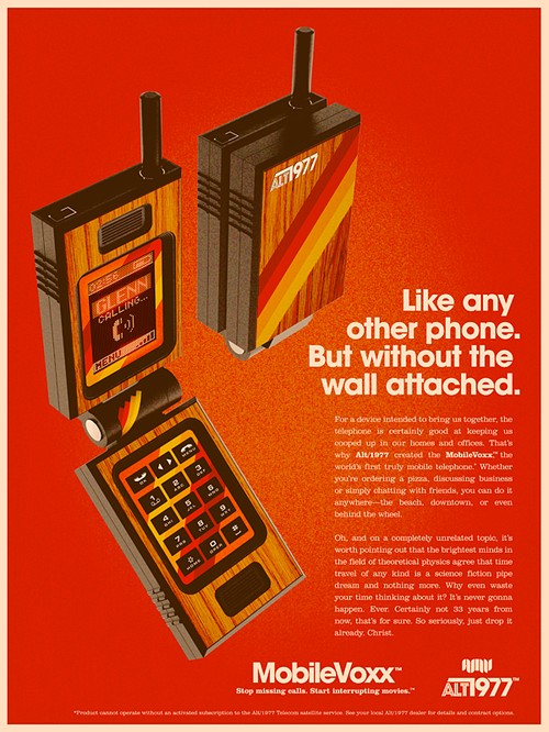
Anyways, it seems digital artist Alex Varanese from San Francisco has pondered about time travel and decided he’d grab all the modern 21st century tech around us and zap back to the late 70s, where he’d re-design all the gear, sell it, and make a bazillion dollars. He took four popular consumer products – an MP3 player, a laptop, a mobile phone, and a handheld game console – and created a set of spectacularly retro print ads to advertise them as if they had been designed in the late 70s. The set is called ALT/1977: WE ARE NOT TIME TRAVELERS, see it after the jump.

Laptron 64

Pocket Hi-Fi

MobileVoxx

Microcade 3000

See more of Varanese’s work on www.alexvaranese.com.

BONUS: You may also like MY DESK IS 8-BIT, Varanese’s vision of what video game might look like if it was a stop motion animation.

[via Behance]

Categories
Arty Awesomeness Featured Inspirational Designs Music

Music, Philosophy, Typography

Music, philosophy, and typography are three of the things London-based graphic designer Mico Toledo loves. And in his weekly project, Music Philosophy, he combines those three elements to create posters of memorable and often profound song lyrics from the likes of The Beatles, The Rolling Stones, Bob Dylan, and even Jay Z. Toledo uses minimal colours and bold typography to great effect.

We totally love his project, have a look at some of his designs after the jump.

Categories
Awesomeness Featured Inspirational Designs Video Clips

Lego Hello World: Horseattack’s Incredible Lego Printer

I have no love for printers. I learned that phrase from a senile old bat who used to tell me that she had no love for blacks, but that’s another story for another time. ;-)

Some time back I tried to install a Lexmark printer but Windows XP told me it couldn’t do that because the printer would compromise my system. Thus began my hate/hate relationship with printers and the bloody cartridges that costs as much as the device itself.

I never thought that the word “awesome” could have been said about a printer, but this is certainly something very special. YouTuber horseattack has built (from scratch) a working Lego printer complete with little Lego workers to operate it. Sure it may take an inordinate time to print anything but at least you won’t pay an arm and a leg for the cartridges. Check out the “Lego felt tip 110” printer as it prints “Hello World” and draws a cute picture of a horse.

[via Riaanwest]

Categories
Arty Awesomeness Featured Inspirational Designs Literature Movies

Hitchcock Re-Envisioned: Fantastic Posters by Laz Marquez

Graphic designer Laz Marquez was chatting to a co-worker about horror films and set out to create an alternative, modern set of posters for some of his favourite Alfred Hitchcock films. He initially started with “The Birds”, and then moved onto “Rear Window” where he played around with the typography. His choice for the third poster was decided by his Twitter and Facebook followers, and in “Vertigo” he pays homage to the iconic original poster created by Saul Bass. The series was completed with a bloody tribute to “Psycho”.

Marquez says this about his body of work:

Since I’ve started this project, I’ve had such an amazing time taking each piece of cinematic history and re-imagining it on my own terms. It’s been spontaneous, challenging and overall fulfilling. In addition, it’s been amazing to put some of the process in the hands of my followers and see what they’ve wanted the project to evolve into. Overall, I couldn’t be happier!

See Marquez’s amazing set of “Hitchcock Re-Envisioned” movie posters after the jump.

Categories
Arty Cartoons & Comics Inspirational Designs

Pot-Shots: Wit and Wisdom From Ashleigh Brilliant

Ashleigh Brilliant (real name) is a 77-year-old author/philosopher/cartoonist from London, UK. He has spent almost 40 years of this life on a project called Pot-Shots. Also known as Brilliant Thoughts, he tries to put down his thoughts in 17 words or less. He hopes that his epigrams will have a profound effect and may “hit you in your heart, brain, or funny bone – or perhaps all three.”

See a couple of pot-shots after the jump.

Categories
Arty Awesomeness Featured Inspirational Designs Weirdness

Spectacular Organic Origami

Goran Konjevod is a professor of mathematics and theoretical computer science. It’s a good thing that he also loves origami otherwise we’d have a tough time convincing you how awesome computer science is.

Channeling his keen mathemagical energy, Mr. Konjevod has made some fantastic 3D paper (and copper) sculptures. He says this about his creations:

Most of my pieces so far are abstract shapes naturally formed by the tension of the paper when multiple layers of paper are arranged according to regular or irregular patterns. In that sense, they could almost be said to be discovered, rather than invented or designed…

…I try to restrict myself to working with single uncut sheets of paper or other foldable material (such as copper), and for the most part use very simple “pureland” folds. Normally, this last restriction would imply that the resulting forms are flat. However, a real sheet of paper is always three-dimensional—even when unfolded—and its thickness brings about a much more obvious three-dimensionality when multiple layers are present.

We think his abstract origami should do all the talking. See a few of them after the jump.

Categories
Awesomeness Entertainment Inspirational Designs Site Announcements TV

The Long LOST Tarot Cards

Graphic designer Alex Griendling hails from Kentucky and must like me, be pretty much obsessed by the all -consuming and awful brilliance that is LOST.

Alex has artfully created a set of Tarot cards that represents some of the main characters and of course the island. Each card is beautifully and darkly designed in a smoke and mirrors sort of way, and symbolizes each character’s essence and being. For those who aren’t sure what tarot cards have to do with anything, tarot cards were originally used for playing innocent card games, but over the centuries  have taken on a more esoteric and mystical function and are now used to tell fortunes. You can read all about traditional tarot decks and their uses here. As far as what tarot cards have to do with LOST, your guess is as good as mine, but none-the-less they seem to fit perfectly with the freakishly weird mysticism and twisted ideology that envelops possibly the best TV show ever made.

If you haven’t watched a lick of LOST, then (I feel sorry for you LOSER) tread carefully as there may be spoilers. See the full list of LOST tarot cards after the jump.

Categories
Arty Awesomeness Inspirational Designs Photoworthy

Mui-Ling Teh’s Ever So Tiny Origami

I haven’t met Mui-Ling Teh, but I can assume she has the most dexterous fingers.

The 23-year old Canadian artist has always been a fan of paper craft and in 2008, she began creating origami on a truly miniature scale. She folds the 15×15mm paper with her fingers and only uses tweezers for the last few folds. Her paper art is millimeters in size and usually captured with a hand-held camera in super macro mode, or shot through a magnifying glass. Her smallest work to date is a crane folded from a 3×3mm piece of trace paper.

Have a look at some of her incredible miniature origami after the jump.

Categories
Arty Awesomeness Featured Inspirational Designs Movies

The Lost Art of Inglourious Basterds

Quentin Tarantino, The Weinstein Company, and The Upper Playground Art Gallery in Los Angeles have teamed up to raise money for the victims of the Haiti Earthquake. For “The Lost Art of Inglourious Basterds” exhibition, 13 artists were asked to make a poster based on their interpretation of Tarantino’s Oscar-nominated flick. The results are fantastic to say the least.

Six copies of each poster were made; they were numbered and autographed by the acclaimed director, and priced not at a 100 Nazi scalps, but a more realistic USD 300.00 each.

The exhibition previewed last night at The Upper Playground Art Gallery, and I’d be surprised if the posters weren’t snapped up in minutes. Have a look at them after the jump.