The ongoing Deepwater Horizon oil spill is creating quite a mess for British Petroleum, or British Polluters as the company is affectionately known. The spill, now considered the largest offshore spill in U.S. history, is obviously no laughing matter but you’d be forgiven for chuckling at the comedic tweets from a fake BP global public relations account, @BPGlobalPR, that proved a further headache for the energy company.
In 2008, environmental organization Greenpeace awared BP the Emerald Paintbrush award for its tireless efforts in greenwashing, a dodgy type of marketing that projects an eco-friendly image of a company without that company actually doing anything to protect the environment. BP was nominated for the Greenwash Awards in 2009, but ended up in fifth place, behind ArcelorMittal, Dong (lol), Shell, and Swedish energy company, Vattenfall.
This year Greenpeace is running a clever competition, entitled Behind The Logo, to highlight the BP’s investment in the Canadian oil sands, where the process of extracting oil produces four times as much carbon dioxide as conventional drilling. Greenpeace says that BP’s slick green logo is a misnomer and are asking people from around the world to create a new logo, something that is more in tune with the dirty business that BP are in. Have a look at some of the new logos after the jump.
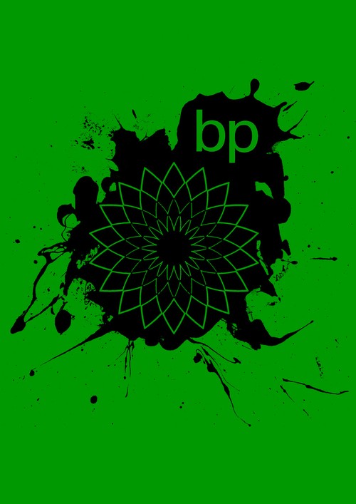
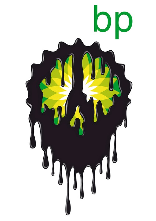

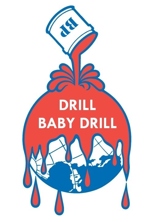


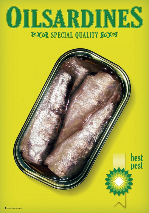
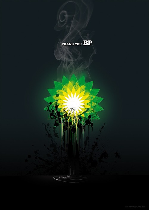
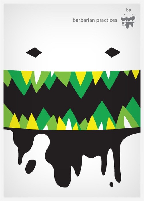
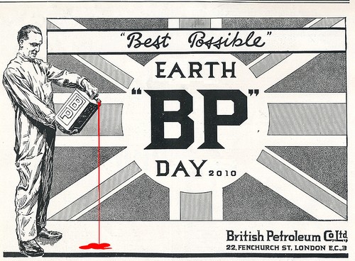
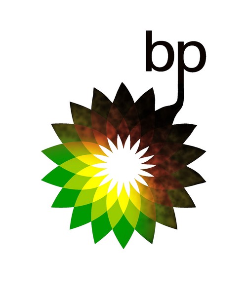
See many more (460 logos at present) on the Behind the Logo Flickr set. If you’d like to enter the competition, the details are available at Green Peace UK.
[via PS3ZA]


1 reply on “Behind The Logo: BP’s Green Emblem Gets Dirty”
In case you’re reading this, a selection of rebranded BP logos have made it into the next round. You can vote for your favourite at http://behindthelogo.appspot.com/category/rebrand