I think I am in love. The more time I spend on Michæl Paukner’s Flickr stream, the more I am drawn into his visual style. He creates a selection of posters and infographics that seem marry science and design in the most beautiful ways. He illustrates some heady, complex stuff that I certainly don’t understand, like the Dymaxion Map and the Antikythera mechanism, they’re all so fantastic to look at.
See some of his art after the jump.
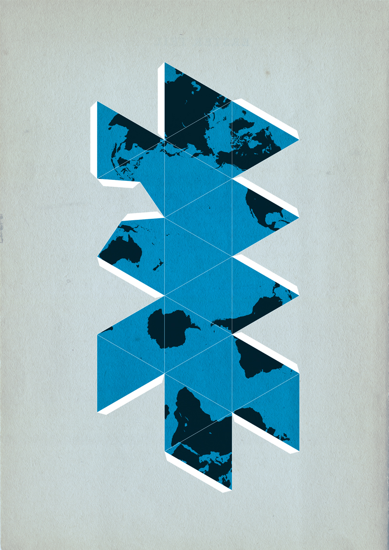
Dymaxion Map
Created by Buckminster Fuller, a distinguished mathematician, the Dymaxion Map is a map of the entire surface of the earth that has been projected onto a polyhedron, unfolded, and flattened to make a two-dimensional map. This process gives the most accurate representation of the shapes and sizes of the land areas. Read more.
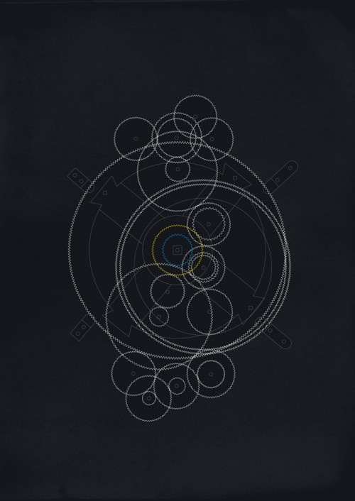
The Antikythera mechanism
Thought to have been built about 150–100 BC, the Antikythera mechanism is the oldest known scientific calculator. Read more.
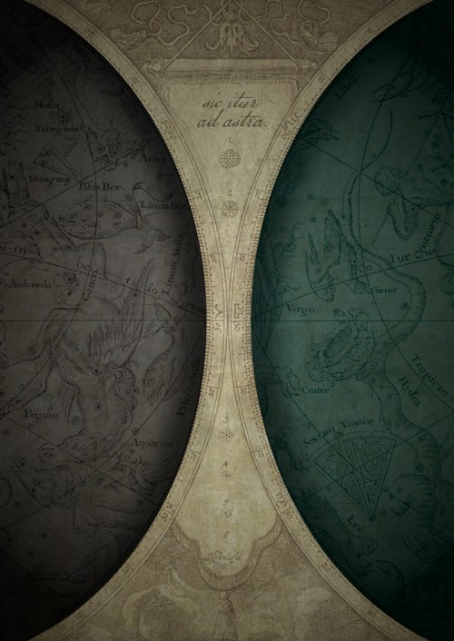
That is latin for “thus you shall go to the stars”. Paukner used old astronomy maps from the 17th century to create this piece.
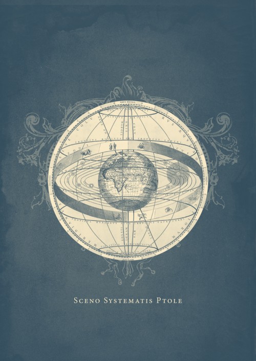
This image shows the geocentric universe of Ptolemy, a Greek astronomer who theorized that the universe revolved around the earth. It was overturned by the heliocentric (in Greek helios means sun) model in the 17th century. Read more.
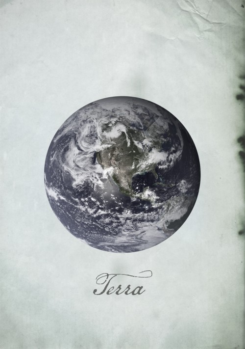
Terra
Most of the information in this image was taken by the Moderate Resolution Imaging Spectroradiometer (MODIS) instrument aboard the Terra satellite, some 700 km above the earth’s surface. It is reportedly the most detailed true-color image of the entire Earth to date.
See more of Paukner’s art on his Flickr stream. And follow him on Twitter.
[via foxinni]


